We are living in an era where Black history is being erased every day, so I understand the excitement over discovering all the amazing things our people have done.
However, while I love me a good fun fact, I cannot help but notice that many of the Black history memes floating around social media are often grossly inaccurate or lacking context.
And some are flat-out wrong altogether.
And I am not talking about small pages either. Many of your favorite Black history accounts with millions of followers put out false information every day in the name of Black history.
Yes, this includes those on Substack… not really sure why ya’ll think this isn’t also a social media platform.
With a culture so rich and expansive as ours, we really do not need to embellish what we’ve done. The work is already powerful on its own.
Here are just a few things I wish we would explain more deeply. I am starting with this one because someone told me to “Shut up” on Instagram for pointing it out.
Mary Beatrice Kenner invented the maxi pad.

Context:
What Kenner invented was called the sanitary belt and moisture-resistant pocket, which is not exactly the same as our modern disposable menstrual pad.
Kenner’s patent eventually expired, leading people to take credit for her invention. A company also expressed interest but pulled back after learning she was Black.1
If Kenner had not been rejected, it is highly likely that she would have also invented the disposable pad, likely based on her original idea. However, what she invented was not the same as today’s adhesive pad, as many of these posts insinuate without proper context.
Here is a timeline from a website on A short history of modern menstrual products:
- 1880s–1890s: Early disposable pads were made of cotton and gauze, often marketed to women traveling by land or sea.
- 1896: Johnson & Johnson marketed “Lister’s Towels: Sanitary Towels for Ladies,” which were a notable early commercial attempt but failed due to social stigma.
- 1918–1921: Nurses in WWI used high-absorbency wood-pulp bandages, leading to the creation of Kotex, the first successfully marketed disposable pad.
- 1926: Johnson & Johnson introduced Modess Sanitary Napkins.
- 1956/1957: Mary Kenner patented an improved adjustable sanitary belt with a moisture-resistant pocket.
What I would change on this timeline, though, is that Kenner’s invention was in the 1920s, but because of racism, the sanitary belt did not come out until the late 1950s.
This is what I mean by adding context or looking deeper into what we read.
Let’s look at another one.
Claudette Colvin was the first to give up her seat before Rosa Parks.

Context:
She was not the first, but one of many. Irene Morgan did it in 19442, and Ida B. Wells did it in 1884.3
There was also Aurelia S. Browder, who did it in April 1955, almost eight months before Rosa Parks’s arrest and a month after Claudette Colvin’s.
History is not the linear event we think it is. There is so much that happened, and so many people it happened to, we might never know about.
What Claudette Colvin and Rosa Parks represent is the culmination of many years of work and sacrifice by many different Black women.
And one more.
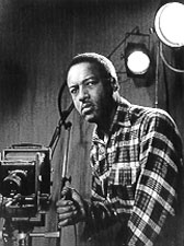
Lewis Howard Latimer invented the light bulb.

Context:
What Lewis Howard Latimer invented was an improved process for manufacturing carbon filaments for electric light bulbs.
In simpler terms, his invention made using light bulbs in homes and businesses more practical. His filaments could be heated to high temperatures without breaking, resulting in longer-lasting, more efficient, and affordable light bulbs.
These are a few easy ones I thought of because I see them a lot, but there are many more.
Before you sit in the Amen corner of anybody’s Black history post (including mine), make sure the information they are sharing is correct. Google (and Google Scholar) is right there.


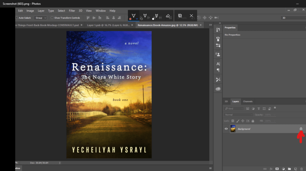
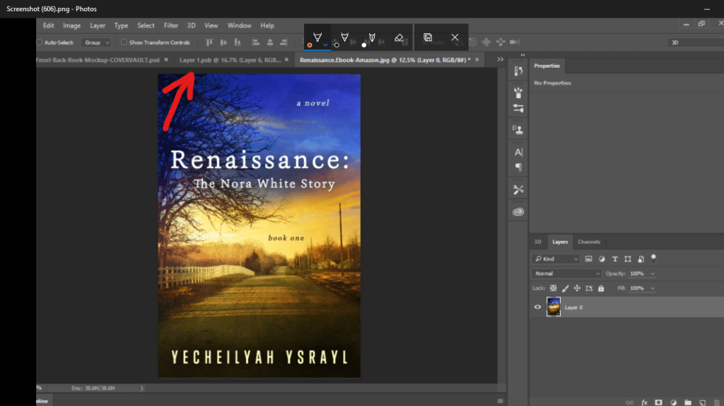
 It will open in Photoshop. When it does, unlock it at the bottom. If you don’t unlock it, you cannot edit it.