You don’t have to write a think piece today.
You don’t have to post a long, drawn-out social media thread about America’s sins.
You don’t have to debate and argue with people in the comments.
It might look like a gloomy day for some of you, but I want to remind you that Joy remains.
And do you want to know why Joy remains?
Other than you woke up this morning?
As Toni Morrison puts it, this is precisely the time when artists go to work!
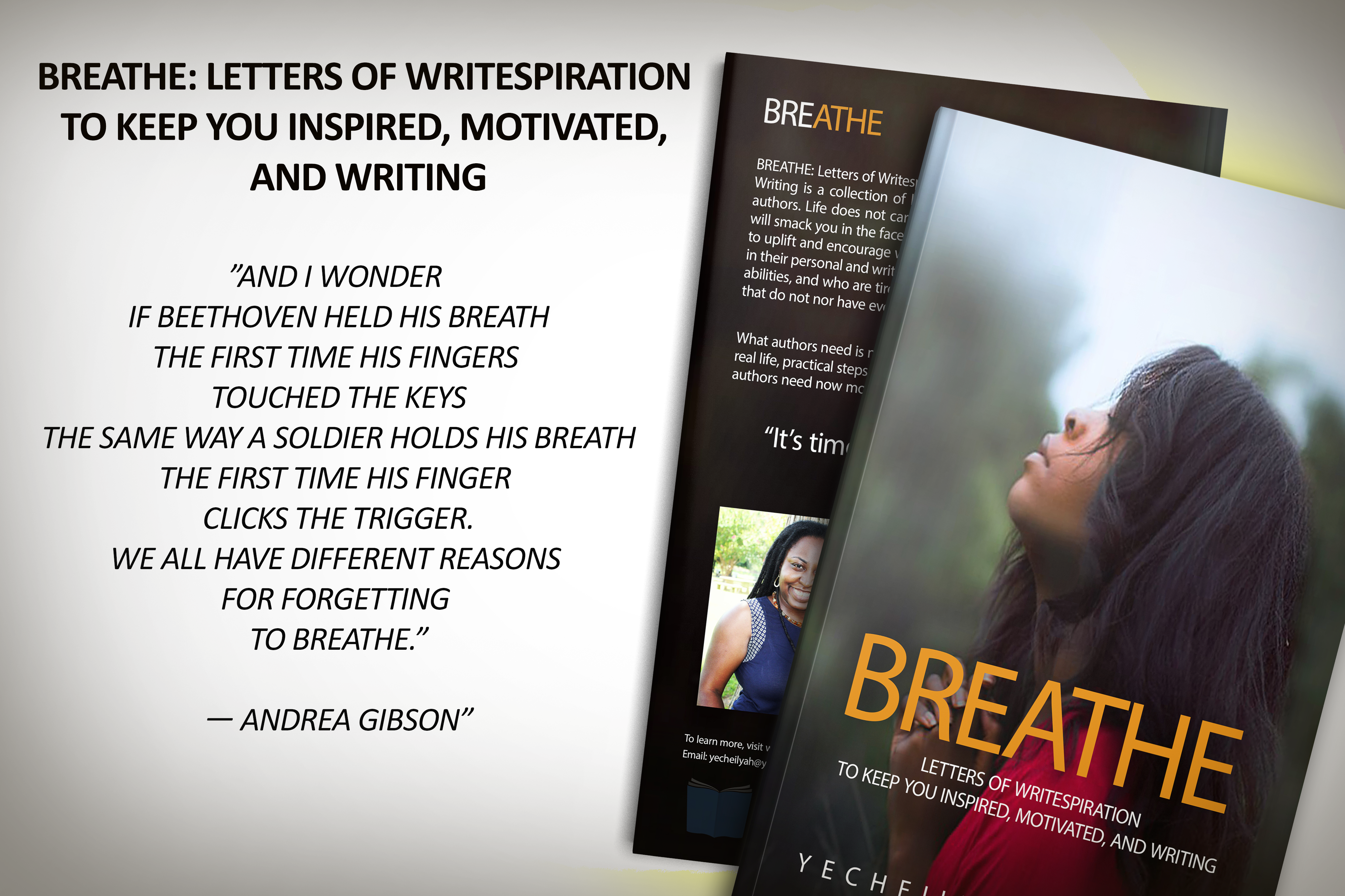
“There is no time for despair. No time for pity. We speak. We write. We do language.” – Toni Morrison
This raw vulnerability many of you are feeling is precisely what you should put into the work.
Allow this emotion, good or bad, to bleed into one of the most potent poems you have ever penned.
Let it be the most profound and truthful piece you’ve ever written.
You don’t have to post it to social media, but write it down.
What I know of moments: They pass.
This historical moment will be written on the pages of history books, so what should you do?
Do what you’ve always done. Do the work.
As one woman put it on Facebook:
“You are awakening to the same country you fell asleep to. The very same country. Pull yourself together. And when you see me, do not ask me, ‘What do we do now?’ How do we get through the next four years?’ Some of my ancestors dealt with at least 400 years of this under worse conditions. Continue to do the good work. Continue to build bridges, not walls. Continue to lead with compassion. Continue the demanding work of liberation for all. Continue to dismantle systems. Continue to set the best example for your children.”
“Continue to be a vessel of nourishing Joy.”
– Venice Williams
Remember, we are accepting submissions for this year’s poetry contest on Joy from now through December 1st! Get started by subscribing at yecheilyahsannualpoetrycontest.org.
Click Here For the Entry Rules and Guidelines
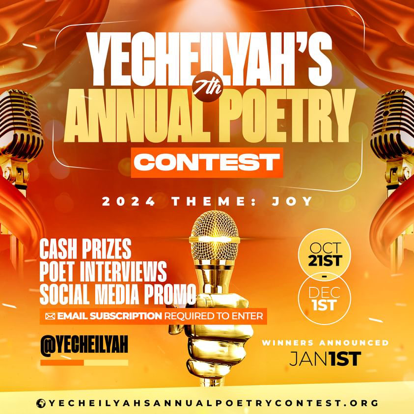
If you would like to support our poets with a donation, you may do so by clicking on the website’s donation page here.
Hope to see you soon!

Yecheilyah’s 1st Annual Poetry Contest Winners, 2017
Yecheilyah’s 2nd Annual Poetry Contest Winners, 2018
Yecheilyah’s 3rd Annual Poetry Contest Winners, 2019
Yecheilyah’s 4th Annual Poetry Contest Winners, 2021