Blogger Tip 01 – How to Resize Images inside your WordPress Media and SAVE STORAGE SPACE..

Very good post from Chris on resizing your images to save storage space in WordPress so you don’t have to upgrade. No use spending money we don’t have to spend. I’ll be doing this tonight. #Winning

Chris The Story Reading Ape's Blog

Have you been using images that are VERY LARGE, and/or, PNG Format?

Have you been reblogging and noticed how LARGE, some folks make their images?

Result

Running out of space in your WordPress Media Storage and thinking about paying for more?

Unless you are displaying your own images / photos, and WANT to have them full size

Before you spend any money, go through your Media Storage images and reduce their sizes

You might be shocked at how much longer you can work with the storage space you save.

Step 1:

Select an image and click on it to see it’s size (width x height in pixels)

and

how much it ‘weighs’ (i.e., how many KB or MB it is):

Step 2

My example has already been adjusted, but you can see it’s size and weight

To reduce them, click on the Edit Image button shown under the image:

Step…

View original post 127 more words

Setting up with MailChimp

Setting up an email list isn’t part of every author’s platform but for those who are looking to set up, you have a number of them to choose from:

  • Convertkit
  • Mailerlite
  • Mailchimp
  • Aweber

….and so on…

Today, I’d like to talk a bit about MailChimp and show you how easy it is to get started. (It is free for your first 2,000 subscribers)

First, go to www.mailchimp.com and set up an account.

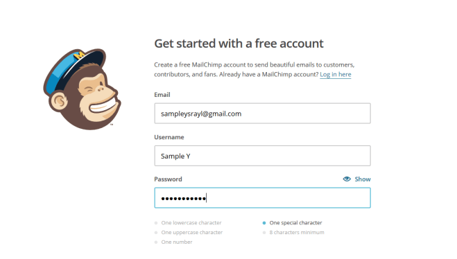
When creating a password, be sure you have a password using at least one capital letter, a number, and a special character:

Example_1 is an example of what would be accepted. If you don’t have at least one number, capital letter and special character it won’t let you go on.

After you set everything up, check your email and activate your account.

Here is where you enter your name and the name of your business.

Screenshot (59)Screenshot (60)

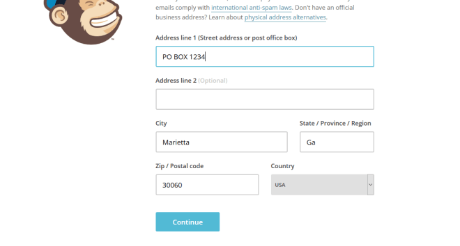
Next, you are going to have to add a physical address. This is because of anti-spam laws. Learn more about that HERE. But you can always come back to this page to change it later.

I would recommend your first and last name and the city, state, and zip in place of Do Not Contact. It looks more professional.

Your Name

Your City, State, Zip

Remember, a street address is optional so you don’t really need that and also remember that you can change this later.

Screenshot (61)

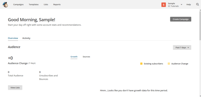
This is your dashboard. When you start sending emails you will see your campaign here, your data and so forth.

Screenshot (62)

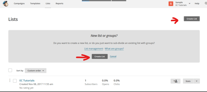
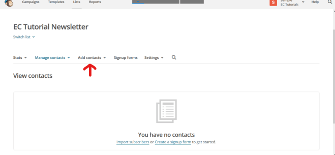
Now for the fun part. It’s time to get started. First, you need to create a List. Click on the List tab.

Go ahead and create list.

Screenshot (77)

List Name > The Name of Your Newsletter

Default from email > Your Business Email

Default Name > I highly recommend using a name people are familiar with already, such as your name. I started with Literary Korner Publishing but then switched to Yecheilyah and my open rates have increased tremendously since then. For your default name, I recommend using your name.

Remind people why they signed up > Wherever people could have accessed your form, put that here “You are receiving this email because…”

Screenshot (84)

Scroll down and check the address for this list. If you want to change it from when you first set up, do that now.

Screenshot (87)

Scroll down. Now that Mailchimp has changed to offer Single Opt-In, you can decide if you want to continue with a double opt in or not. Double Opt-In means once people sign up to your list they will have to confirm again before they are added, like always. Single Opt-In means they are automatically signed up when they first fill out your form. No checking emails and confirmations. They will be automatically added.

If you want Single Opt-In, leave this as is. If you want double opt-in, click on it.

Now, move on to notifications and check all that apply. It’s just asking how often you’d like to be emailed on activity with this list.

Screenshot (90)

Next, you’ll see this page. Until someone is subscribed to your list, you’re done.

Or, you can manually add subscribers you have been given permission to add.

You can also import contacts from your email, assuming you’ve been given permission from those people to be added.

In any event, you won’t be able to send a Campaign or email until you have subscribers to the list.

To manually add subscribers, click add contacts and go from there. In the meantime, let’s move on to how to send emails.

(Reaching out to people to ask if they would like to join your list and if you can add them manually is another great way to increase your number of subscribers. Everyone doesn’t have to sign up, sometimes you can get creative and just ask around (Text messages, Facebook Messages, DM Twitter and IG Messages) All that matters is that you have their permission to sign them up.)

Screenshot (95)

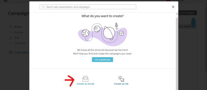
I added myself so that I can show you how to create a Campaign. Click on the campaign tab to get started. This page will come up with the floating arrow to show you where to click.

Screenshot (99)

Click on Create Email

Screenshot (103)

Name your campaign. Whatever your email is about.

Screenshot (105)

The next page is self-explanatory. Just complete the fields based on your list. The To field will ask what list you are wanting this email sent to. Choose the list (you’ll just have one list if you just started), save and proceed to the other fields.

Screenshot (109)

When you get to Design Email, you’ll see a page come up that looks like this. Choose the template of your choice. I am going to go with the follow-up.

Screenshot (111)

This is where you design your email. It’s super easy. Just drag, drop and enter text wherever you want. I am not going to bore you with a step-by-step with this. At least not yet, maybe in another post. However, I would like to caution about one thing….

Screenshot (113)

When I first started my email list I had colors and pictures and it was just going all the way on. While I can only offer suggestions (not guaranteed solutions), I would advise against this. As much as we want to showcase our personality, it helps if our email design is plain and simple. I know, that sounds boring but it’s easier on your audience.

Your email list is really not about you, it’s about the people who read them. Everything, from your subject line to your content and even your design is about making it easier on your subscribers. Therefore, I would say to stay away from too many colors, lots of widgets and pictures, and super long emails.

Personally, I love using my Cartoon Bitmoji as well as my Banner. Aside from these basics, I have taken everything else away. Here’s a snapshot of my real email list to give you an example:

Top

Screenshot (121)

At the top I have my banner (which can be your logo) and a display of my social media buttons. I WOULDN’T PUT MY SOCIAL BUTTONS ALL THE WAY AT THE BOTTOM. I would put them at the top and at the bottom.

Body

Screenshot (122)

The body of my emails have gotten a makeover since I first started. Black letters or gray against a white background. That’s it. Plain, simple, and easy to read.

Bottom

Screenshot (123)

My bitmoji cartoon takes us on out with a reminder to add me to your address book (so my emails don’t go to your spam), check your Spam and Junk Folders (in case my emails go to spam), and a reminder that Gmail emails from Mailchimp tend to go into the promotions folder.

Very Bottom / Signature

Screenshot (126)

Under the reminders is another look at my social widgets and my links.

OK, we’ve had enough Mailchimp for today. Just make sure your emails are clean, easy on the eyes (colors that are not too light or dark), easy to navigate and to the point.


Yecheilyah (e-see-lee-yah) is an Author, Blogger, and Poet of nine published works including work in progress and short inspirational guide “Keep Yourself Full.” Learn more by exploring Yecheilyah’s writing on this blog and her website at  yecheilyahysrayl.com. Renaissance: The Nora White Story (Book One) is her latest novel and is available now on Amazon.com.

Subscribe to Yecheilyah’s Email List HERE.


Editing Mock-Ups in Photoshop: Don’t Forget to Hide Layers You Don’t Want to Show

In May, I wrote a blog post tutorial on how to edit Mock-Ups in Photoshop for a professional looking 3D book cover image. I understand it went over some heads (Photoshop is not for everyone), but for those of you who are familiar with it already, be sure that you are hiding the layers you don’t want to use so your image looks more authentic.

Everyone is using Mark Monciardini’s Mock-Ups (Covervault) because they’re free. While everyone is using them, not everyone is familiar with the basics of Photoshop in ways they can get the most out of the experience. It’s like copying someone but because you don’t really know how to do it, it doesn’t have the same look. Mark is the real artist and we are all copying him pretty much. He has extended his expertise to us newbies by generously giving away his mock-up templates. Now anyone, with just a basic knowledge of Photoshop, can have professional looking 3D book cover images. But, make sure you are hiding layers you don’t need so your images don’t look the same as everyone else.

I’m going to use the wine bottle glass template as an example.

What you have here is everything as it is originally. One of the first things you’ll probably want to do is change the book cover. Most people stop here. Boom, they are done. Save. You can do that but it won’t look very original.

Here’s mine with Renaissance cover. It looks good but not very original. I did change something though. Can you guess what it is? No, not the cover. (Learn how to change the cover HERE) I changed something else.

I hid a layer and took something away. That’s right, there are no sparkles.

To switch things up, all you have to do is hide layers you don’t need or want in your image.

To hide the particles, I went over to the layers and clicked on the drop-down menu next to particles. Next to the sparkles, (I like the word sparkles better. Sounds more girly lol), I clicked on the eye to hide them. That is literally all I did.

You can do this with anything you don’t want in your image. Even the background. Don’t like the wine bottle look? Get rid of it.

If I don’t want the background at all, I can hide the background and upload my own. All I did was click on the eye next to backdrop and hid it (you can also delete layers but I prefer hiding them in case I want to use them again).

Here’s a closer look:

Basically, whatever you don’t want in the image can be hid. You can now use the space to add text, a logo or whatever you want. While all this is optional, remember that if you’re going to add text to a mock-up that has a lot going on, we won’t be able to read it clearly if you don’t hide or delete those layers first. Let’s look at one more:

This is the original but remember, you can completely make it over so it looks more you.

First, you want to get rid of all these leaves (unless of course you want them there which I don’t). To hide them, go over to layers and click on the eye to all the leaves. Light Leaf, heavy leaf and big leaf. Hide them all.

The leaves are gone but that background still makes it look leafy. Unless you want that, you can change the background too or hide it altogether.

To change the background, go over to layers and hide the entire background.

What you have is a blank slate. You can now add text, logo, whatever you want.

You can actually upload your own background but we’ll go over that at a later time.

The point is that if you’re going to pay for Photoshop you may as well get as much from it as possible. To help your images to look more authentic, be sure to hide (or delete) layers you don’t want or need.

Here’s a finished one using one of my WIP:

Editing Mock-Ups in Photoshop (In 12 Steps)

I didn’t plan on sharing this but as I was editing some mock-ups I thought it would be nice to share what I am doing.

I am not a professional photographer, and I don’t always have a chance to take professional images. Therefore, I love using free mock-up templates to create professional images of my books. I am learning Photoshop also because if I can master it, I can also start to create my own book covers! (OK, that’s a far way off but a sista can dream).

But, while I am finagling (am I the only one who thinks finagle is a funny word?) around with this, I decided to put together a quick tutorial on what I am doing for those of you who use Photoshop. It’s super easy and if you have Photoshop, you should be able to get started right away.

Note: I’m not a professional “Photoshopper” and have instead found my own way of editing mock-ups because this way is easier for me but there are lots of other ways to do this.

Step One

Get Photoshop. You can get Photoshop CC for as low as $10/month. For me it’s worth the money because I use mock-ups often. However, there is a free trial you can use for seven days if my memory serves correctly. http://www.adobe.com/ (There are also plenty of free ways to create 3D images. I use Photoshop because the quality of the images is top notch.)

Step Two

Once you have Photoshop, find a free mock-up that you like. Be sure the license allows you to use it. Most of them do as long as you don’t try to sell the mock-up as your own. You can find some great ones at http://covervault.com/

Step Three

Download a mock-up you like. I’m going to use this one.

Step Four

Click on the zip file and double click on the Photoshop file to open it.

OK so you can pretty much change anything on here to make it your own. Eliminate the background, upload your own images, change colors, etc. But…

I’m just gonna show you how to change the book covers.

Step Five

Go to the side panel here. Let’s start with the front book cover. Click on the arrow next to Front Book, scroll down to front cover and double click on the space where the front book cover is…right where my arrow is.

It will bring up the mock cover here..

Step Six

File > Open > Find the cover (or image) you’d like to use on your computer and click on it….and

Screenshot (601)Screenshot (602)It will open in Photoshop. When it does, unlock it at the bottom. If you don’t unlock it, you cannot edit it.

Step Seven

Click on your cover and drag it to the mock layer.

Step Eight

This one has lots of special effects I don’t need. If ever you don’t want something in the image you can either delete the layer or hide it. Click on the eye next to the layers to hide them. I want to hide the mock-up text and other things…

If you did it correctly it should leave only your cover and look like this (below)…if you look at the layers next to where my marker is you will see that the eye is closed. This means I am hiding these layers so they don’t show.

Step Nine

As you can see, when you move your cover to the layer (see step seven) it will be too big. On your MAC click command T to highlight it to resize. On PC click ctrl T. Now just resize it to fit the space.

Step Ten

Save your resized cover. File > Save as (save it under a name you will recognize. You will need to remember where you saved it.)

Screenshot (621)Screenshot (627)

Step Eleven

Go back to the panel and right click in the space next to the front cover.

Step Twelve

If you did it correctly, it should bring up the box below…where you see replace contents, click on that.

When the box opens, find your saved image from Step Ten and replace the mock image with your own.

And that’s it!

For the back cover follow the exact same steps:

  • Click on the arrow next to back cover.
  • Double click on back cover
  • File > Open > Choose the image for your back cover
  • If it’s locked, unlock it
  • Click and drag your cover to the mock layer (you can’t move it if it’s locked)
  • Hide any layers you don’t need/want
  • Resize image > Command T (MAC) or Ctrl T (PC)
  • File > Save as to your PC
  • Back to the panel, right click in the space next to the back cover > Replace contents
  • Find saved image > place

The last thing you will do when you have both the front and back cover done is to File > Save as > PNG

You’re done.

Renaissance: The Nora White Story Book One. July 15, 2017. yecheilyahysrayl.com