We often talk about how attractive the book cover should be, and for good reason. Poor cover art is the #1 mistake Self-Published authors make when publishing print books.
But we know that already.
Let’s go inside of the book this time.
When preparing your manuscript for publishing in a print book, the formatting should be done in a way that is different from a college essay, research paper, or blog post.
Here are the top print book mistakes I see self-published authors make and how to avoid them.
Disclaimer. I am not a lawyer. Nothing beyond this point should be taken as legal advice.
No Copyright Page
The copyright page of a book is one page that lets people know who owns the rights to the book and that, generally, the author’s intellectual property cannot be copied without permission.
You do not need to register your book with the copyright office to add this page except if you want to. In this case, register the copyright at copyright.gov. You can do it after you publish the book to Amazon since it takes about 6-13 months (of this writing) to go through.
However, know your book is automatically under copyright when creating it.
The copyright page discourages theft, such as plagiarism, and announces you as the book’s owner. It is like a “No Trespassing” sign; every book should have one.
If you own a software program such as Atticus (PC) or Vellum (Mac), they have copyright templates already designed for you. If you don’t have these programs, creating one is easy. All you need is a copyright notice and a rights reserved.
© 2024. Yecheilyah Ysrayl. All rights reserved.
You may also add additional information. Below is an example of a basic, full copyright page.
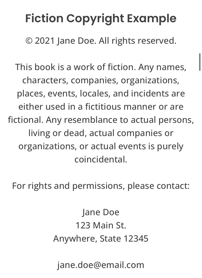
It should also include your ISBN. For more on ISBNs, click here and here.
This page should appear at the beginning of the book, also known as the book’s front matter, after the title page. The title page is one page that looks like the cover but without the artwork. It includes the book’s title and the author’s name. This title page may appear twice, depending on the publisher. Once at the book’s opening and once more before the opening chapters.
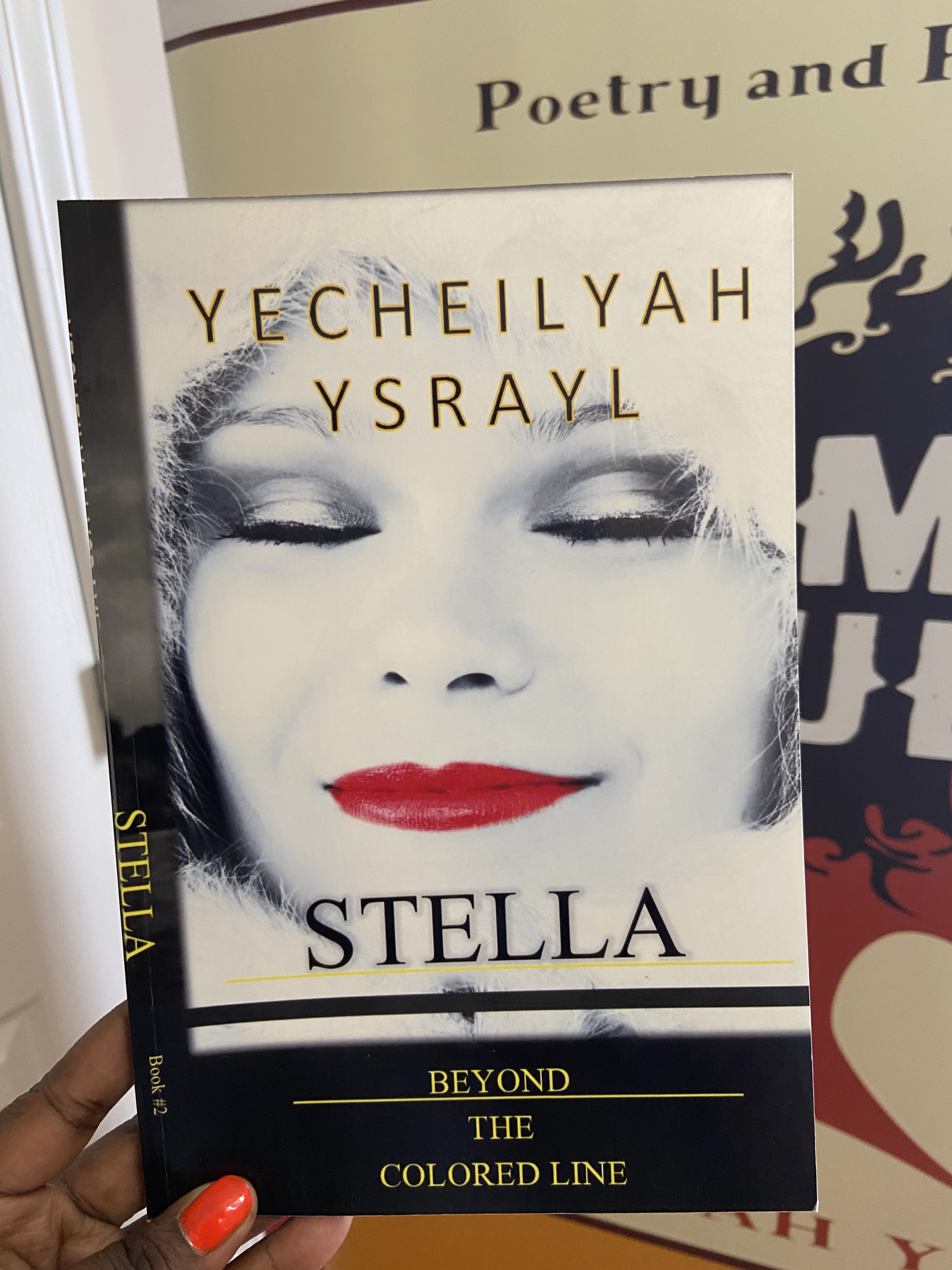
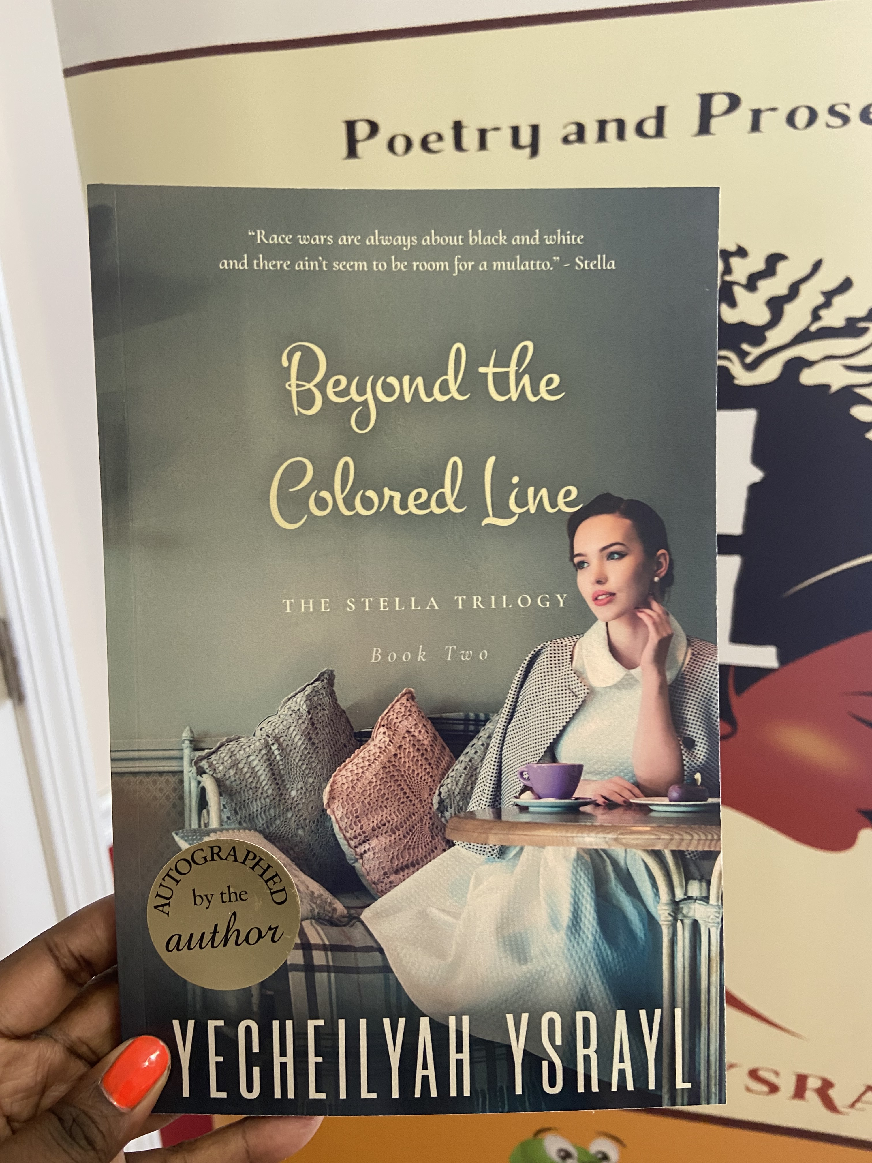
The Author’s Name and Title are Not on the Spine
This is easily avoidable with a professionally designed book cover, but let’s touch on it a bit.
Some books do not need a spine because they are too thin. Otherwise, you will want to have your author’s name and title on the spine of your print book.
The spine binds the front and back of the book and is also important for bookstores.
With the author’s name and title on the spine, a book is easier to find for someone skimming the titles on shelves. Since self-published books are already underestimated, a book without a spine can easily get lost, and the author misses out on sales.
The first thing a potential customer will see is the outward-facing spine, so if the book does not have a title or author name, readers won’t even notice the book.
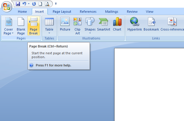
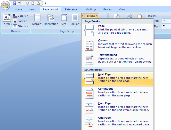
No Chapter Headings
A chapter heading is how you organize your book so readers know when a section begins and ends. It is literally as simple as adding Chapter One….Chapter Two…Chapter Three.
Chapter headings can also have subtitles or names instead of numbers. In Black History Facts, I use chapter headings and subtitles.
Chapter One (Chapter Heading)
What You Didn’t Learn About Sundown Towns
(Subtitle)
The purpose of chapter headings and sections is to organize the book to make it easier to read and follow. Without it, readers might get confused about where they are in the story. Believe it or not, there are so many authors who make the mistake of not including chapters, making the book look more like an essay.
If you have a software program or professional who formats books, this is easily avoidable as they can add them for you.
Fancy Text
One of the most common mistakes of first-time self-published authors is using fancy text.
Times New Roman, Arial, Helvetica, Calibri, and Cambria are great fonts for books that make them easier to read!
Cursive writing and other fancy text, including colored fonts, make them harder to read.
Too Much Space and Not Enough Words…
Indie Authors who self-publish should also be aware of too much spacing, making the book look like it was written for children (unless it was). An adult-level book should not have so much space between it and the next section that you could write a short bio about your life in between.
Be sure to fill blank spaces with words or shorten the book’s length.
Plan to publish a print book? Don’t forget to add a copyright page, spine, chapter headings, text that is easy to read, and a book with enough words to fill it out.
Investing in professional cover design and interior formatting will help with all of this!