Dear Self-Publisher, How Your Book Looks Inside Matters Too: Don’t Forget Typesetting

By now, we know how important it is to have a dope book cover for our Self-Published book.

But it’s not always the book cover that gives a book away that it’s Self-Published. Sometimes, how the book looks inside makes it look homemade.

Typesetting: the spacing between words and letters, the font type & size, the page’s trim size, margin, and overall layout.

Grab a book that has been traditionally published (or professionally Self-Published!) and look over the pages. Take note of how it appears on the inside. Look at how tidy the words are! How are the left and right edges aligned, the typefaces are the same, and the paragraph spacing is perfect?

This is the result of expert typesetting.

Many Self-Publishers skip this stage. We don’t realize it because we submit the Word or PDF file we used to compose the book to our preferred print-on-demand.

But what’s wrong with that?

There is nothing wrong with that, except our manuscripts do not print exactly as we type them in Word, Google Docs, or Scrivener. The document requires proper typesetting and formatting for print and digital devices like Kindles and Tablets.

The cover of your book may suffer from a poorly formatted book. Take a look at book two in The Stella Trilogy, first edition.

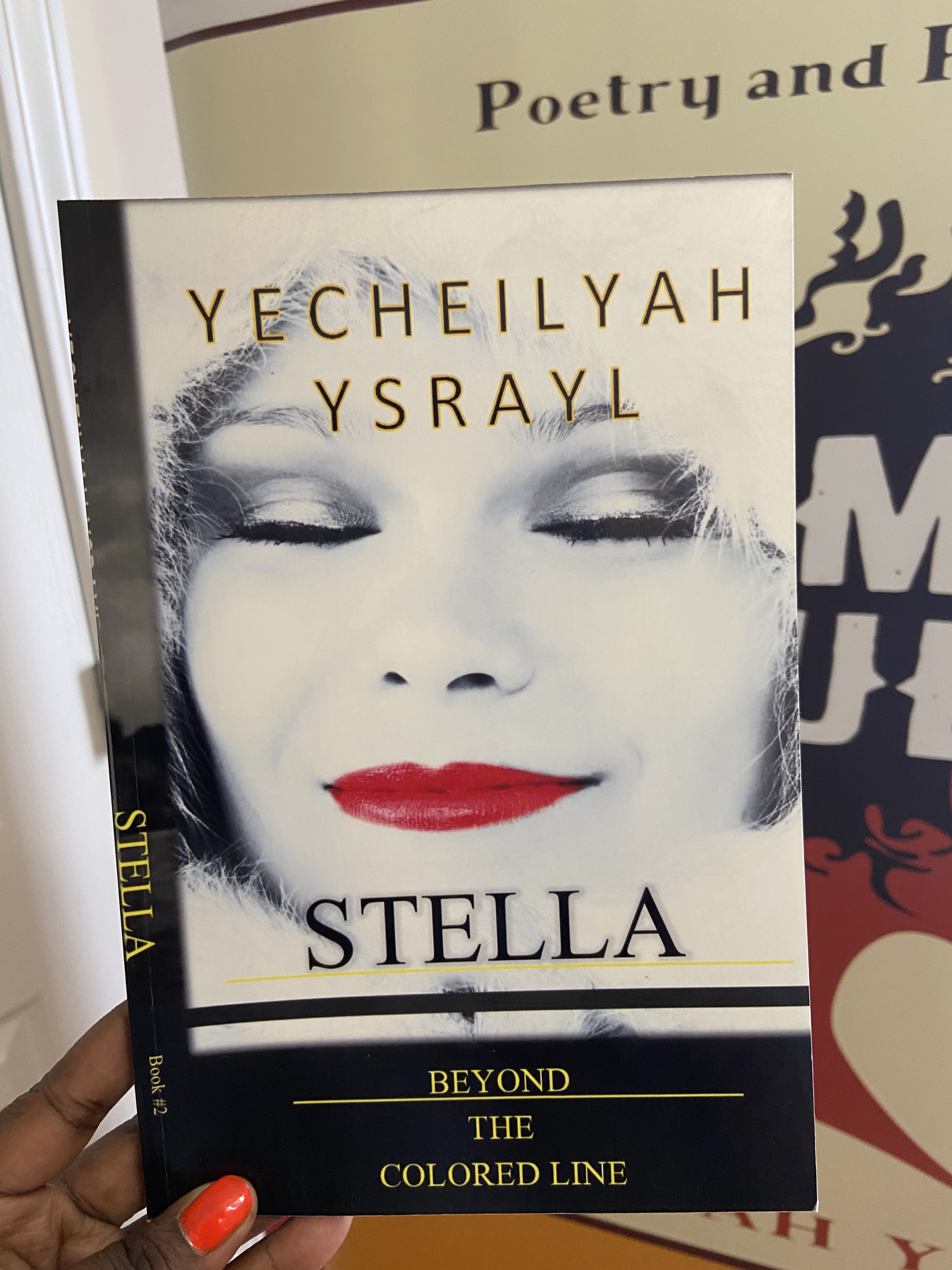
I actually like the initial cover image. The problem is with the rest of the book.

Do you notice how the spine is twisted? Because the book was too short to have a spine, this occurred. Giving it one, nonetheless caused it to wrap around and face the front.

I didn’t realize the book needed more pages for a full spine because I’m not a graphic artist or skilled book cover designer.

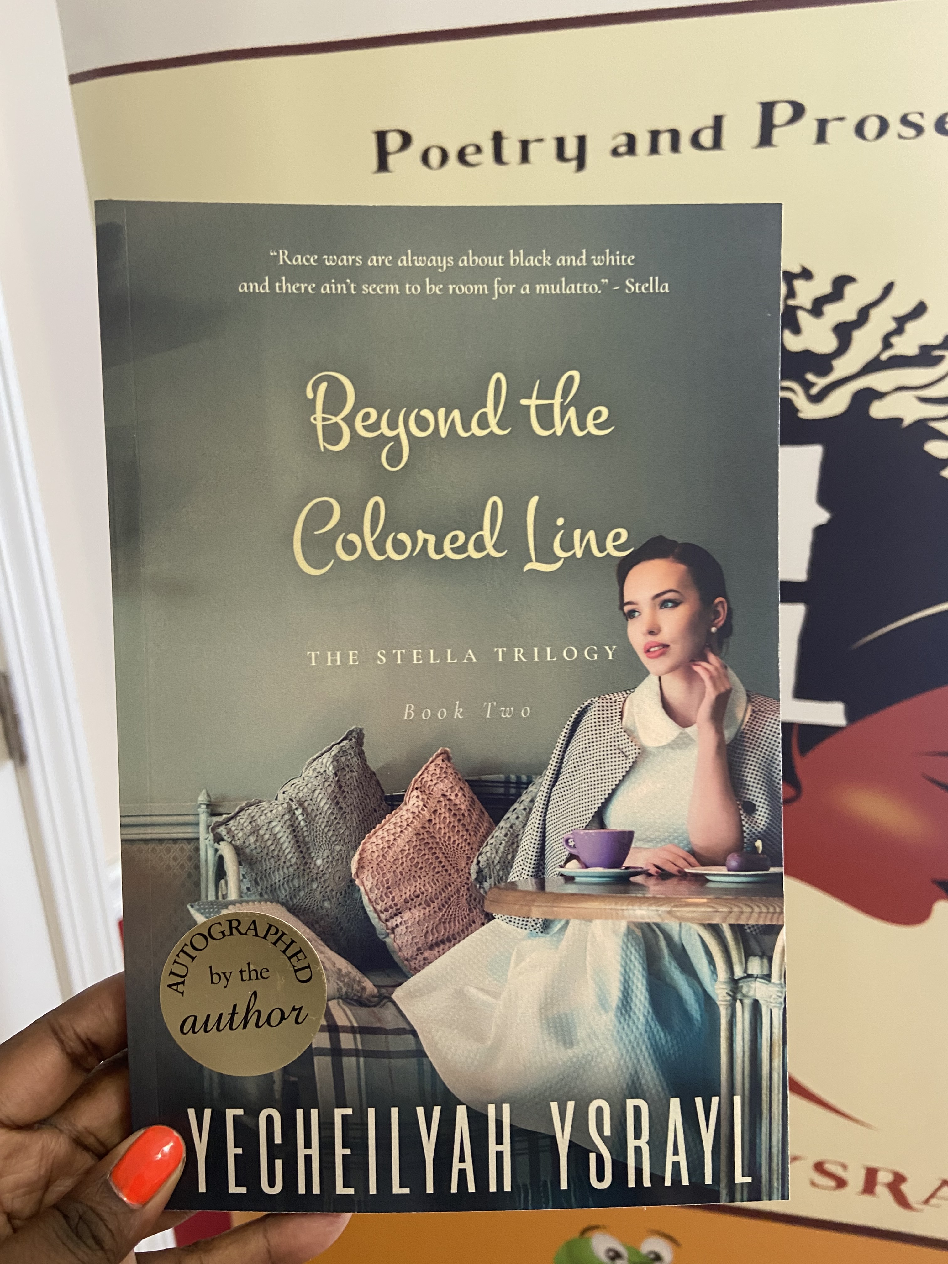
While this cover image doesn’t pop as well as the first (IMO), the book is professionally bound. The alternate ending made the book long enough for a spine in the revised edition. The book features a more professional cover, professional formatting, and professional editing.

Recommendation. Before having your entire cover designed, wait until your book has been edited and properly typeset. Your graphic artist will require the precise number of pages and trim size to create a cover, back, and spine that perfectly matches the book.

Moral. Before hitting publish, make sure to hire a skilled typesetter to correct the placement of your text on the page.

If you want to try it yourself, here are some sources:

  • Reedsy Book Editor
  • Adobe In-Design
  • Microsoft Publisher
  • Vellum
    *Fiverr. Note: Professional typesetters can be found on websites like Fiverr. Make sure they are typesetting rather than just typography, though. Typefaces and other decorative elements make up typography. That’s not typesetting. Additionally, if they are only using Vellum, you can do it on your own by simply purchasing it.

Click Here to Check out More Indie Author Basics

Indie Author Basics streamlines and simplifies self-publishing so you can publish high-quality books without pulling out your hair.

The One Thing Self-Publishers Overlook When Publishing Print Books

I am getting book one in The Stella Trilogy ready for its March 24th release. Preparing this book led me to notice the one thing about my books I had neglected and the one thing Self-Publishers overlook when publishing print books.

Not all Self-Published books look mediocre because of poor cover design and editing. Lots of Self-Published books have excellent covers and are packaged well on the outside.

But there is one thing that separates most Self-Published paperback books from Traditionally Published paperback books in terms of quality.

I am talking about typesetting.

“Typesetting is the process of setting text onto a page. In this stage, which occurs towards the end of book production, the typesetter arranges the book’s interior to create the best reading experience.” 

– Reedsy 

The key is to have a Self-Published book indistinguishable in quality from high quality Traditionally Published and Independently Published books. The way the author or book designer arranges the text on the page has a lot to do with this.

Here are some suggestions for improving typesetting (if you are not paying someone to do it):

  • Don’t space your words out so much. You don’t need to double-space to that extent. You will know you have too much space if the text looks light. But also, don’t squish them together too tightly either. You will know this if the text looks too dark. (Try maybe 1.5 spacing).
  • There’s no need to double-space after periods. This practice came from the typewriter when characters were the same width, but with modern computers, there’s no need to do this.
  • The first paragraph of a chapter should not be indented. Subsequent chapters in a fiction book can be indented. Nonfiction books use a block style instead of an indent, where there is no indentation on the next line.
  • Don’t forget to add page numbers.
  • In fiction writing, the dialogue starts on a new line every time a new person is speaking, should be enclosed with quotation marks, and with each new line indented.

Wrong:

“Oh my gosh, Nora, really?” Lisa rolled her eyes. “I’m just saying,” debated Nora, “that word gets you lynched where I come from.”

Correct:

“Oh my gosh, Nora, really?” Lisa rolled her eyes.

“I’m just saying,” debated Nora, “that word gets you lynched where I come from.”

  • If you are not sure about font, serif font is a good choice.
  • Set your paragraph alignment to justified. Justified means the left and right edges are straight. This looks neater and is easier to read.
  • Make sure your trim size is appropriate for the size book you want to publish. The size of a typical novel is 6×9, but you may want your book to be shorter in size. Change the trim size in word by going to Layout > Size.
  • Adjust your chapter headings (you do have chapter headings, right??), so they are not too far down the page.
  • A new chapter starts on a new page.
  • When uploading your document to KDP, consider uploading a PDF copy of the MS, not a Word Doc.
  • Make sure your paperback book is not just edited but also formatted. You can use formatting software or pay someone to arrange the text for you. I prefer to pay a professional to do all this for me after the book has been edited. 

Available Now. Click Here.


It may seem small, but if you are Self-Publishing a paperback book, good typesetting makes for easy reading. This is one of those behind the scenes things that readers only notice if it’s done wrong. No one would have paid attention to the man, eating, and drinking air in Tyler Perry’s A Fall from Grace if there was food on his plate and water in his glass.

The same applies here. Readers care about the story. They are not going to pay attention to the typesetting unless it is so out of sorts it becomes distracting. 

If I open your paperback book and there’s enough space for me to write a whole diary entry between paragraphs, or it looks like a DIY your little brother put together, I am going to notice it.

It is not always a bad book cover or poor editing that brings down the quality of some Indie books. It is the typesetting or the way they print the text on the page that gives the book away.

Want more Indie Author Tips? Visit the Indie Author Basics with EC page here!