
Really? Is she really talking about self-publishing again? Yes, as a matter of fact I am. I already told you I’m in love with writing.
So, we’ve discussed briefly some Common Sense reasons to take advantage of the Self-Publishing Industry, and we’ve even talked about the professionalism (or lack thereof) among the industry. Today however, I would like to feature an article (with my 2 cents in-between) that will shed some light on some of the most common self-publishing mistakes known to Indie Authors. Ready? Alrighty then, let’s go. Excerpts written by Cate Baum:
Book Cover Designs
 “It may seem very easy to take a snap and use it as a cover, slotting it into one of the simple templates available on many of the book publishing platforms such as Createspace at Amazon. However, these templates should be used only as a very last resort. Why? Because these templates are truly only there for the most design illiterate of us all, and for those who don’t much care about how their book looks, for instance, maybe the book is being published for a charity or a niche, local audience who anticipate the book’s availability. There is a completely blank template for adding your own design, which is perfectly sized. I use this one with my own design, forgoing all of the added titles and image holders on the others; because if you wish to sell your book to a new audience out there, you’re going to need to spend some time or some money on a cover. Make sure your cover is eye-catching and clean, and can be seen at a distance because thumbnails on Amazon, Barnes and Noble and most other book sites are going to use a thumbnail to show your book off as a first point of sale.”
Very good advice! I must admit I am guilty of doing this very thing years ago as I embarked on the Self-Publishing path. But as I began to look more deeply into the professional outcome of the product, it became clear to me how important the book cover design was to the book. The content is the most important no doubt, but book cover designs are also just as important. I think authors should sit back and ask themselves (as I ask myself), no matter the audience, and no matter whether or not you’re trying to make Oprah’s book club, “what do I really want from the end product?” Just because you don’t expect to get rich, doesn’t mean your work can’t be the best. Remember, “Be exceptionally good at everything you do because light attracts light.” Check out these “Lousy Book Covers” for an example of what not to do (really, that’s the name of the website, I didn’t make that up): http://lousybookcovers.com/
Not Spending Enough Energy on Editing

“We say this many times over, and I am constantly surprised by the number of self-publishers who go ahead and publish anyway, even when they know themselves their book contains errors! This is death to your book sales, and will not be ignored by readers, not just for this book but for all your books connected to your name. Editing is fairly expensive and tedious, but if you wish to make sales and give up the day job, it is vital you edit your work. Two-part edits are minimum: a proofread to find spelling and grammar errors, and then a formatting pass, followed by a structural edit to the actual story and characters. This will flag up any parts of the book that do not communicate well and parts where you’ve dragged on or skipped over detail that could become boring or confusing to your readers. In such a tough and competitive market an edit is an essential, professional process for any serious writer, even if you think you can spell, write, format and structure I bet you money an editor will find a bunch of stuff that you had missed, wood-for-the-trees style.”
So true. I know I know, would all of the grammatical geeks please calm down? Nobody cares that you’ve counted over 50 grammatical errors in this post already, that’s what we have you for. 🙂
But seriously, I notice that one of the hardest stumbling blocks to tackle for some Indie Authors is finances. Often, we don’t put a lot into the editing of the material because we can’t afford it. But, if you want the most professional look possible, I would highly suggest you invest in editing. If nothing else, put some sheckles (yea, I said that), away for a decent editor to be your extra set of eyes, it may just save your novel’s life. Now don’t get me wrong, I’m not as critical a reader as some may be when it comes to grammatical errors but I’m telling you now, if it’s so bad that it becomes hard to read, that’s going to throw me off completely and I’m gonna care more about watching the Walking Dead than reading your book.
Insisting on a Fancy Font
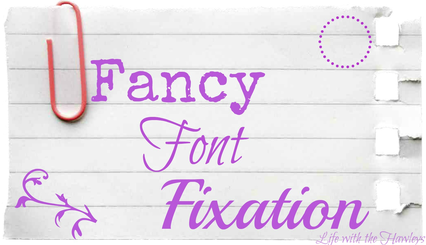
Ok, thanks a lot Cate, but I think I’ll take it from here.
Please don’t do this people. Unless your book is some kind of graphic specialty or Children’s Book or something that requires some kind of cursive expertise, please don’t adjust your fonts in fancy writing. Only because you’re not in grade school anymore, the focus here is not how cute it looks, but how professional. Below is a basic list of the kinds of fonts that I would suggest for Chapters and such:
• Times New Roman
• Verdana
• Calibri
• Garamond
• Tahoma
Since I have to go now, I’d have to come back to this topic, but I hope what little information I was able to share may be of assistance to you. The most important obvious investments you can start out with though is Editing and Book Cover Design.
